Typography problems can cost you the next inquiry before a prospect evaluates your machinery, certifications, or delivery capability. Industrial buyers often scan a website first, looking for evidence that a supplier is organized, technically competent, and safe to contact. If the page makes basic information difficult to find or read, the buyer may treat that friction as a warning sign.
The practical test is simple. Identify the visible typography failure, connect it to the buyer's decision process, then apply a specific correction. We'll examine seven bad typography examples through scanning, technical comprehension, credibility, and quote-request friction. You'll also get a fast self-audit for hierarchy, readability, contrast, spacing, and mobile presentation. If typography problems expose deeper issues in your content, design, or lead-generation system, Machine Marketing can help diagnose the wider problem instead of treating one page in isolation.
Table of Contents
- 1. Poor Hierarchy When All Text Looks the Same Size
- 2. Font Pairing Chaos From Too Many Typefaces
- 3. Line Length Overload With Text That Stretches Too Wide
- 4. Insufficient Contrast Between Text and Background
- 5. Awkward Letter Spacing That Feels Cramped or Disconnected
- 6. Orphans and Widows That Leave Single Words Hanging
- 7. Inappropriate Font Size Scale for Body Text
- 7 Common Typography Mistakes Compared
- Run a 15-Minute Typography Diagnosis
1. Poor Hierarchy When All Text Looks the Same Size
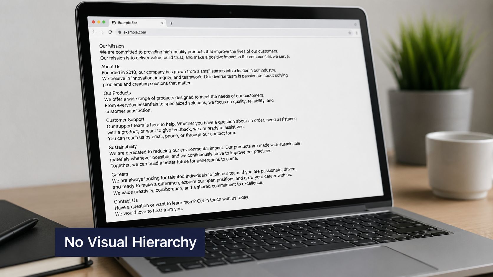
A page fails its first usability test when the headline, supporting copy, specifications, and call to action all look equally important. An industrial buyer should be able to identify the product, its application, and the next useful action without reading every line. If every element uses similar size and weight, the page becomes a flat field of information.
Consider an equipment spec sheet where every label is set at the same size. “Operating range,” “material compatibility,” and a long technical qualification may appear identical. The reader has to decode the document before deciding whether the product fits. On a machine shop website, a Request a Quote button that looks like an ordinary navigation link creates the same problem. The buyer may understand the service but miss the intended path to contact.
A useful reference is the guidance on what an H1 tag does. The H1 should identify the page's primary subject, while subheadings and supporting text should organize the details beneath it.
Diagnose the page before redesigning it
Take a screenshot and view it at 50% zoom. Can you still identify the main offer, the most important proof point, and the quote-request action? If not, the hierarchy isn't doing enough work.
Use a type scale tool such as Modularscale to establish consistent relationships rather than choosing sizes one element at a time. As a starting rule, make the H1 visibly larger than the H2 headings, with at least a 1.5 times size relationship where the design supports it. Add padding above and below key sections so important information has room to breathe.
The best correction may be modest. You don't need a dramatic redesign or decorative display font. You need a clear sequence, page title, section heading, body copy, proof, and action. A professional graphic design studio can help when the problem extends beyond type sizing into the wider visual system.
2. Font Pairing Chaos From Too Many Typefaces
Too many typefaces make a technical website feel assembled rather than engineered. A machine shop using Georgia for body copy, Helvetica for headings, Comic Sans for testimonials, and a custom font for navigation forces the reader to interpret the design before interpreting the message. The result is visual noise, and the inconsistency can weaken confidence in the supplier.
The same issue appears when different designers contribute different pages to an industrial equipment website. One service page uses a geometric sans-serif, another uses a humanist sans-serif, and a third introduces a display face. Each choice may look acceptable alone. Together, they make the website feel like several systems joined without a governing standard.
This matters during a B2B evaluation because buyers compare details. They may review capabilities, download a technical document, check an application page, and return to the contact form. If headings, labels, buttons, and body text change personality from page to page, the experience loses continuity. That doesn't prove the company lacks operational discipline, but it can create unnecessary doubt.
Build a small type system
Start with one primary typeface and use its available weights before adding another family. A second face can work for a clear reason, such as separating editorial content from interface controls, but it shouldn't solve a problem that weight, size, or spacing could solve.
Use Google Fonts pairing suggestions as a starting point, then test each choice in the actual interface:
- Headlines: Check whether the face remains clear at large and medium sizes.
- Body copy: Read a real service description, not placeholder text.
- Technical labels: Test short labels, units, part names, and form fields.
- Buttons: Confirm that the call to action remains legible on mobile.
Document the choices in a living style guide. A consistent industrial website design system should define families, weights, heading levels, buttons, captions, and fallback behavior. The trade-off is variety. You may lose some visual novelty, but you gain recognition, maintenance speed, and a more credible buyer journey.
3. Line Length Overload With Text That Stretches Too Wide
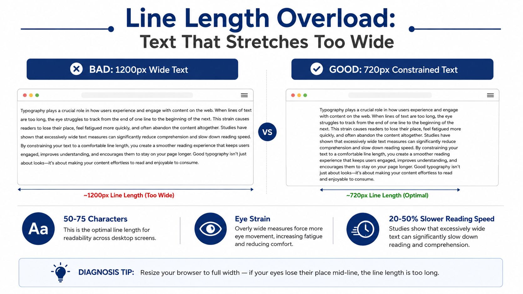
A full-width text block can look efficient while making technical information harder to scan. On a manufacturing website, a service description stretched across a desktop viewport forces the eyes to travel too far between line starts. Industrial buyers often review capabilities, materials, tolerances, or process details quickly. Losing their place can delay comprehension and add friction before a quote request.
The U.S. Web Design System typography guidance recommends keeping most lines between 45 and 90 characters, with about 66 characters as a useful target for long-form reading. Treat that range as a starting point, not a fixed rule. Tables, specifications, short labels, and interface panels need layouts that support comparison or quick recognition. Paragraphs need a controlled measure so the reader can scan without tracking long horizontal bands.
Consider an equipment manufacturer whose blog container expands across nearly the entire desktop width. The writing may be accurate, yet the page develops weak visual rhythm. A machine shop can create the same problem when every service description runs from one viewport edge to the other. The buyer must work harder to connect a paragraph's opening with its next line, especially while checking technical language.
Correct the measure first
Adding line height will not solve an oversized text column. More vertical space can improve comfort, but it cannot remove the eye movement created by long lines. Constrain the paragraph container, then tune type size and spacing together.
Use a browser ruler or extension to inspect the rendered width. Test the same content at different font sizes, because larger text generally needs a shorter measure. Keep body copy left aligned, separate paragraphs clearly, and reserve full-width layouts for specifications or other content that benefits from horizontal comparison.
Practical rule: If a reader must move their head or repeatedly search for the next line, the text column is probably too wide.
A constrained layout may leave unused desktop space. That trade-off usually pays off when buyers can scan specifications, understand service explanations, and reach the quote form with less effort. Test the final version with real technical copy on the devices your industrial buyers use, rather than judging the layout from an empty design file.
4. Insufficient Contrast Between Text and Background
Light gray text on white, dark gray on a dark hero image, and colored text on a busy background all create the same business problem. The information exists, but the buyer has to work to access it. In bright daylight, a machine shop page with white body text over light blue can become practically unusable on a phone.
Contrast supports both readability and scanning. A buyer checking material capabilities, tolerances, lead times, or a contact form needs to locate the relevant information quickly. If secondary text fades into the background, the reader may skip it. If form labels are difficult to distinguish, the quote request becomes more effortful and errors become more likely.
The WCAG 2.1 specification also provides a valuable spacing test. Content should remain usable when users increase line spacing to 1.5 times line height, paragraph spacing to 2 times, letter spacing to 0.12 times the font size, and word spacing to 0.16 times the font size. These requirements expose layouts that only work when text stays tightly controlled.
Add contrast checks to the workflow
Use a contrast checker during design and before publication. Stark, available as a Figma and Adobe plugin, can help teams test interface colors while they work. Don't rely only on a desktop monitor. Check pages on a mobile device in bright conditions, with browser zoom and user text settings applied.
For the correction, use a solid or sufficiently dark background behind body copy, remove unnecessary text shadows, and reserve muted colors for secondary information. The Uxia accessibility testing platform offers another reference for accessibility testing practices. Contrast isn't merely a compliance task. It tells a technical buyer that your company has considered how people use the information.
A darker gray may be more comfortable than pure black in some designs, but comfort must not come at the expense of distinction. Test the result, then keep the stronger option wherever the text carries operational or conversion value.
5. Awkward Letter Spacing That Feels Cramped or Disconnected
Letter spacing can decide whether an industrial buyer scans a heading or skips it. Tight tracking makes characters merge, especially in all-caps text. Excessive tracking creates visible gaps, so a short tagline no longer reads as one phrase.
A machine shop website might use an all-caps testimonial heading with compressed spacing to create a strong visual block. On a small screen, however, the buyer sees a dense row of similar shapes and may miss the message before reaching the proof point or quote request. An industrial equipment site can make the opposite mistake by spreading a tagline so widely that its meaning feels fragmented.
The practical question is how spacing supports technical comprehension, not whether the typeface is serif or sans-serif. A recent systematic review of accessible typography synthesized multiple peer-reviewed empirical studies. Its findings indicate that no single size or typeface suits every reader and situation. Narrow spacing, condensed fonts, extreme weights, and heavy embellishment can reduce legibility, while serifs themselves were not a significant legibility factor.
Set rules that scale
Treat tracking as part of the type system, not a decorative adjustment made by eye on one screen. Use relative units such as em so spacing scales with the text. Test the result at different viewport widths and zoom levels, then review the labels buyers use to identify equipment, materials, and specifications.
- Body copy: Keep spacing natural and avoid forced tracking.
- All-caps labels: Add enough space to separate characters, then check the overall word shape.
- Large taglines: Reduce excessive gaps until the phrase reads as one unit.
- Small interface text: Test familiar and easily confused characters in real labels.
Uppercase text also needs sufficient line height. Keep it out of long paragraphs, where dense letterforms slow scanning and can hide the next action. The correction is often small, but it affects whether a buyer reaches the technical details or quote form.
Use open letterforms and comfortable spacing when credibility and comprehension matter more than visual aggression. Confirm the change on a phone, because a treatment that looks forceful in a desktop mockup may become difficult to read at the point of decision.
6. Orphans and Widows That Leave Single Words Hanging
A single word stranded at the start or end of a paragraph can make an otherwise polished page feel unfinished. In a technical document, a short connector or unit separated from its phrase may also slow comprehension. These details matter to buyers who spend time reviewing specifications, case studies, and process explanations.
An industrial case study PDF might leave “by” on one line and the related measurement on the next page. On a machine shop blog, a narrow mobile layout may repeatedly strand one word at the end of a paragraph. Neither issue makes the page unusable on its own, but repeated wrapping problems signal that the content system wasn't tested with real copy.
The repair starts in CSS, not in endless manual editing. Use widows: 2 and orphans: 2 in base styles where browser support and the document context allow it. Then test actual content across desktop, tablet, mobile, and zoom settings. Mobile layouts are especially prone to awkward breaks because the available measure changes sharply.
Protect meaning, not just appearance
Avoid justified alignment for ordinary web content unless you control hyphenation and line breaks carefully. Uneven word spacing can create its own reading problem, particularly in technical paragraphs with long terms, model names, and abbreviations.
For proofed documents, manual non-breaking spaces can keep short phrases together. Use them selectively. Overusing non-breaking spaces can create overflow or produce a worse line break at another viewport.
A polished paragraph isn't one that never wraps. It's one that wraps without separating words the reader needs to understand together.
Review the page as a buyer would. Does the paragraph communicate a capability smoothly, or does the eye stop at every awkward break? If the content needs more structural control, the website redesign project plan can help connect typography decisions to templates, content governance, and page-level conversion goals.
7. Inappropriate Font Size Scale for Body Text
Body text that is too small adds friction before a buyer can assess your equipment or request a quote. Text that is too large creates a different problem: technical explanations start to resemble headlines, pushing specifications and proof points farther down the page. The right scale depends on the typeface, x-height, viewing distance, device, and information density.
An equipment spec sheet set at 11px may contain every required detail yet still force readers to zoom or squint, especially on a phone. At the other extreme, ordinary paragraphs at 20px consume excessive vertical space. The page feels inflated, and buyers must scroll farther to compare capabilities, certifications, or delivery details.
Readability research links smaller type with slower, more demanding reading. Use the findings from this comparative typeface study as a practical reminder that typeface and size must be tested together, rather than approved as isolated design tokens.
Test the system with real content
Set a readable baseline, then test actual paragraphs, forms, specifications, tables, and navigation. Placeholder copy hides problems such as long model names, measurement units, and dense technical terms. An industrial buyer scanning for a material, tolerance, or production capability should not need to enlarge the page before understanding the relevant point.
Typeface choice changes the result. The study found that Verdana was read faster than Georgia at every tested size, while larger type increased reading speed and reduced fixation duration. A size that works for one typeface may feel cramped or oversized in another, so review the complete page system in context.
Set line height generously. Accessible typography guidance commonly places body text around 1.4 to 1.6 line height, with 1.5 as a practical default, as outlined in this inclusive typography guidance. Confirm usability at 200% zoom, and test mobile layouts without requiring pinching.
Correct the scale at the system level: establish a readable body size, preserve clear hierarchy, and give technical content enough space to support comprehension before the quote form.
7 Common Typography Mistakes Compared
| Issue | Implementation Complexity 🔄 | Resource Requirements ⚡ | Expected Outcomes 📊 | Ideal Use Cases 💡 | Key Advantages ⭐ |
|---|---|---|---|---|---|
| Poor Hierarchy: When All Text Looks the Same Size | 🔄 Medium, establish typographic scale, spacing, CTA emphasis | ⚡ Low, designer/dev time; CSS changes | 📊 Higher scanability and conversions (typ. +20–30%) | 💡 Landing pages, product pages, CTAs | ⭐ Clear visual hierarchy; faster comprehension |
| Font Pairing Chaos: Mixing Too Many Typefaces | 🔄 Medium, audit fonts and enforce pairs site-wide | ⚡ Low–Medium, design decisions, possible font licenses | 📊 Stronger brand consistency; reduces perceived unprofessionalism (~25–40%) | 💡 Rebrands, multi-author sites, design systems | ⭐ Cohesive typography; easier scaling |
| Line Length Overload: Text That Stretches Too Wide | 🔄 Low, add max-width or multi-column layouts | ⚡ Low, CSS container and layout tweaks | 📊 Improved reading speed and comprehension (users read 20–50% faster) | 💡 Long-form content, blogs, documentation | ⭐ Better readability; less eye strain |
| Insufficient Contrast: Text That's Hard to Read | 🔄 Low–Medium, adjust colors and test ratios | ⚡ Low, color updates + contrast tools | 📊 Accessibility compliance (WCAG) and reduced bounce; helps older users (40–60% impact) | 💡 Public-facing sites, mobile in sunlight, accessibility-first projects | ⭐ Improved accessibility, trust, and scannability |
| Awkward Letter-Spacing: Text That Feels Cramped or Disconnected | 🔄 Low, tweak tracking per size and context | ⚡ Low, small CSS changes and testing | 📊 Reduced reading friction; +15–25% scanning speed | 💡 Headlines, all-caps elements, brand typography tweaks | ⭐ Improved legibility and polished appearance |
| Orphans and Widows: Single Words Left Hanging | 🔄 Low, CSS (widows/orphans) or non‑breaking spaces | ⚡ Very Low, minor CSS/manual edits | 📊 Small gain in perceived polish; minimal comprehension change | 💡 PDFs, case studies, narrow/mobile layouts | ⭐ Cleaner, more professional typography |
| Inappropriate Font Size Scale for Body Text | 🔄 Low, set baseline font-size and responsive scaling | ⚡ Low, single CSS change + testing | 📊 Significant readability/accessibility gains; reduces comprehension loss 20–30% | 💡 Any content-heavy site, B2B audiences, accessibility compliance | ⭐ Immediate legibility improvements and WCAG alignment |
Run a 15-Minute Typography Diagnosis
You don't need to redesign the entire website to find the highest-friction typography problem. Start with the elements that can prevent a buyer from reading or acting at all, then move toward polish. Capture one desktop screenshot and one mobile screenshot of a key service page, product page, or quote-request path.
Use this order:
- Check body size and contrast. Can you read the page without zooming, squinting, or searching for muted text? Test the form, footer, technical notes, and mobile view, not just the hero section.
- Check hierarchy and line length. Reduce the screenshot to 50% zoom. Can you identify the page subject, major sections, proof, and next action? Measure paragraph lines against the 45 to 90 character guidance rather than allowing the container to expand automatically.
- Check font consistency. Compare the header, navigation, service pages, downloadable documents, buttons, and forms. Record every typeface and weight, then remove choices that don't serve a clear function.
- Check letter spacing and wrapping. Look for cramped uppercase text, disconnected taglines, single-word lines, and awkward page breaks. Apply a CSS fix or revise the content component instead of manually correcting one page.
- Check mobile presentation. Review the page in bright light, at increased zoom, and with real technical copy. A desktop layout that looks clean may still create quote-request friction on a phone.
Record the highest-friction issue and assign one specific owner and fix. For example, the fix might be a narrower content container, a darker body color, a larger base size, or a shared heading component. Avoid changing every font at once. Controlled changes make it easier to identify what improved and prevent a local correction from breaking the broader system.
Typography isn't decoration placed after the strategy. It helps buyers scan, understand technical information, judge credibility, and decide whether contacting you will be easy. The most useful kinetic typography perspective still starts with a basic principle, motion and style can't compensate for text that users struggle to read.
Run the audit on the page that generates your most valuable inquiries, fix the clearest barrier first, and then inspect the rest of the customer journey for the same pattern.
Machine Marketing helps manufacturers, machine shops, and industrial business owners diagnose website structure, typography, industrial SEO, content, CRM, and lead-generation systems as connected parts of growth. Visit Machine Marketing to discuss a practical website and marketing-system diagnosis, then turn the highest-friction finding into a defined next step.