Is Your Logo Working as Hard as You Are? Your company logo is often the first impression you make. But for many established industrial businesses, a logo built for print catalogues and business cards now struggles on websites, in emails, and on social media. That mismatch creates friction you can feel in sales decks, LinkedIn profiles, equipment decals, and distributor materials.
For manufacturers, this isn't just a design problem. It's an implementation problem, a trust problem, and sometimes a lead generation problem. We see logos that look fine on a trade show booth but collapse into noise in a browser tab. We also see the opposite. Companies chase a trend, lose the elements buyers recognize, and create internal confusion that lasts for months.
We're going to diagnose 8 real-world logo before after transformations and pull out the strategic thinking behind each one. You'll see what changed, why it changed, and how to pressure-test the same decisions inside your own brand system. If your team also struggles to keep files, versions, and usage rules aligned across departments, this guide for People Ops on brand assets is a useful companion read.
Table of Contents
- 1. Firefox Logo Redesign Simplification for Digital Speed
- 2. Warner Bros. Logo Evolution Maintaining Heritage While Modernizing
- 3. Mastercard Logo Redesign Subtraction as Innovation
- 4. Google Logo Evolution Playfulness Meets Purpose
- 5. Slack Logo Redesign Symbol Expansion and Flexibility
- 6. IBM Logo Redesign Geometric Precision and Heritage
- 7. Tesla Logo Redesign Minimalism Reflects Product Philosophy
- 8. Pringles Logo Redesign Character Refinement Maintaining Brand Soul
- Before & After: 8 Logo Redesigns
- Diagnose Your Own Logo Your Next Steps
1. Firefox Logo Redesign Simplification for Digital Speed
A buyer sees your company mark for half a second in a distributor portal, then again on a machine plate, then later in a cramped mobile email signature. If the logo only works in the polished version from your brand deck, it is already underperforming.
Firefox is a strong logo before after example because the redesign solved a functional problem. The older mark carried more illustration and texture. The newer version shifted to a cleaner shape that reads faster, scales down better, and stays recognizable across digital touchpoints.
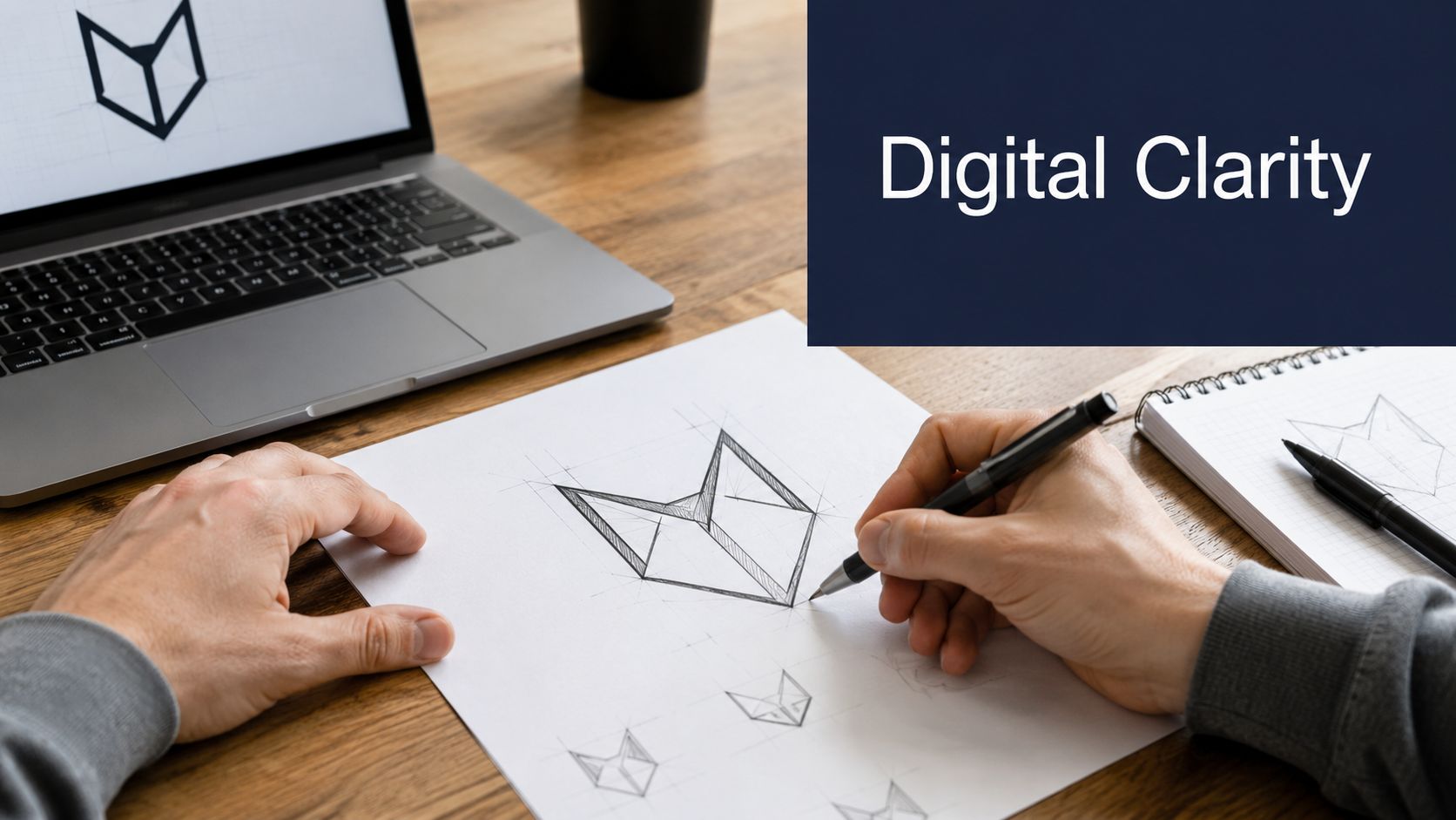
That same pressure shows up in industrial and manufacturing brands all the time. A logo has to hold up on a website header, a LinkedIn avatar, a quote template, a control panel decal, and a one-color print on a spec sheet. Fine detail rarely survives that full system.
Color discipline matters too. Firefox keeps the palette focused and the silhouette clear, which makes the mark easier to recognize and easier to reproduce consistently. That is not just a design preference. It lowers implementation friction across vendors, packaging runs, signage updates, and internal templates.
For industrial firms, this connects directly to brand longevity. A mark that depends on gradients, tiny outlines, or ornate detailing usually creates cost and inconsistency later. Companies planning a broader repositioning should tie logo decisions to a wider long-term engineering brand strategy, not treat the redraw as an isolated creative exercise.
What manufacturers can borrow
The useful lesson is simple. Design for the hardest real-world application first.
- Test at favicon size: Shrink the mark to browser-tab scale and mobile shortcut scale. If it turns into a blur, recognition drops in search results, saved links, and distributor systems.
- Check small-format production use: Print it in one color at the size it would appear on labels, badges, or equipment plates. If key shapes disappear, the logo is carrying too much detail.
- Create a simplified operating version: If your current mark includes seals, gear teeth, gradients, or small type, build a reduced version for micro-applications and vendor-controlled environments.
Practical rule: If the mark only works when it is large, it is not a flexible B2B asset yet.
I see this mistake often with engineering-led companies. They assume complexity signals precision. Buyers usually read it differently. Clear, controlled branding suggests competence, easier implementation, and a company that pays attention to details that affect the customer experience.
2. Warner Bros. Logo Evolution Maintaining Heritage While Modernizing
Warner Bros. didn't abandon the shield. That was the smart move. The company refined an instantly recognizable asset so it would hold up in digital environments without throwing away the visual memory people already had.
That's the exact tension legacy industrial brands face. A company that's been in business for decades often asks the wrong first question: “Should we keep the old logo or replace it?” A better question is: “Which parts carry recognition, and which parts are just old execution choices?”
What to protect in a heritage brand
For Warner Bros., the answer was clear. Keep the shield, keep the broad identity cues, remove the visual noise. The same logic works for an established manufacturer with long-standing signage, truck graphics, stamped parts, and distributor literature.
A useful diagnosis starts with a touchpoint audit. Where does the logo appear now? Your website, quoting templates, machine enclosures, packaging, invoices, LinkedIn, trade show walls, sales presentations, and safety documentation all place different demands on the mark.
Buyers usually don't need you to look new. They need you to look current, reliable, and easy to recognize.
If your company has fifty years of earned recognition, don't erase that equity casually. In some cases, a subtle redraw can do more for the business than a dramatic rebrand. We see this often with engineering-led firms whose customer base includes repeat buyers, procurement teams, and distributors who notice inconsistency faster than they notice artistic improvement.
A redesign also has to support the broader brand strategy, not just the logo file. If your market position is shifting, this long-term engineering brand strategy perspective helps frame the decision beyond visual preference.
Three questions usually reveal the right path:
- What do long-term customers recognize first: The shape, initials, color, or full wordmark?
- Where does the current logo fail today: Small screens, embroidery, signage, stamped parts, or social media?
- What should never change: Usually two or three brand elements deserve protection. Identify those before any design work starts.
Warner Bros. is a reminder that modernization works best when it respects memory.
3. Mastercard Logo Redesign Subtraction as Innovation
A common branding problem shows up after years of growth. Sales uses one logo, distributors use another, the plant has an older version on equipment decals, and the website carries a cleaned-up mark that never made it into the field. Mastercard is a strong before-and-after example because the redesign solved that kind of sprawl by clarifying what customers already recognized.
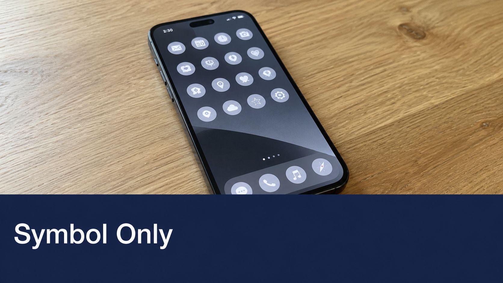
The overlapping circles were doing most of the brand work. Once Mastercard saw that clearly, it reduced dependence on the wordmark in selected applications and made the identity easier to deploy across digital and physical touchpoints.
That lesson applies directly to manufacturers.
We regularly see industrial brands carrying a primary logo, a legacy mark, a tagline lockup, a certification-style badge, an initials version, and a few unofficial distributor edits at the same time. That does not create flexibility. It creates approval delays, inconsistent quoting materials, mismatched signage, and extra cost every time someone has to guess which file is current.
When subtraction works
Subtraction works when the market already recognizes the visual core of the brand. If the symbol has not earned that recognition, removing the name usually weakens clarity.
That distinction matters in B2B. If buyers know you as "Tri-State Fluid Systems" and barely notice the icon beside the name, a symbol-only system will create friction in sales conversations, vendor forms, and trade show follow-up. If your initials or emblem already appear on machine panels, uniforms, crates, service vehicles, and packaging labels, you have a stronger case for reducing the system.
Mastercard succeeded because subtraction improved usability. The redesign made the brand easier to reproduce consistently across screens, cards, signage, and small-format placements. For industrial companies, the equivalent test is less about aesthetics and more about operational control. Can the mark survive embroidery, laser marking, control panel labels, ERP-generated documents, and a LinkedIn avatar without losing recognition?
The trade-offs are usually straightforward:
- Symbol-only improves application speed: It works well for favicons, app icons, decals, stamped parts, and social profile images.
- Wordmarks improve recognition: They help in new territories, low-awareness channels, investor decks, and first-touch sales materials.
- A two-part system often makes more sense: Many industrial brands need a primary logo and a simplified symbol, with written rules for where each version appears.
Before removing any wordmark, test three places that expose weakness fast: your website header, a business card, and a LinkedIn profile image. Then test the less glamorous environments that matter just as much in manufacturing, such as equipment decals or printed labels. If the symbol cannot carry recognition on its own, simplify the architecture first and keep the name attached until the market catches up.
4. Google Logo Evolution Playfulness Meets Purpose
A company updates its logo, rounds off the rough edges, swaps in a cleaner typeface, and six months later the market still sees the same brand. That is the point. Google's evolution worked because the redesign improved legibility and consistency without stripping out the parts people already recognized.
Industrial and manufacturing brands can use that lesson. A logo can become easier to apply across HMI screens, trade show graphics, distributor decks, safety documentation, and equipment badges without turning into a generic corporate mark. The job is to improve function while keeping enough personality to preserve memory.
How to keep personality without losing discipline
Color is usually the first pressure point. Many B2B companies default to blue because it signals trust and technical competence. The trade-off is obvious. In crowded categories like automation, controls, industrial software, and engineered services, blue by itself rarely gives you distinction. If your palette stays conservative, the shape, spacing, and typography have to work harder.
That is where Google made a smart choice. It kept a playful color system, but paired it with cleaner letterforms and better digital rendering. For an industrial brand, the equivalent move might be keeping a familiar accent color from legacy product decals while refining the mark so it reproduces cleanly on spec sheets, dashboards, and etched plates.
Three checks usually expose whether a logo still has character and enough control:
- Run a grayscale test: If the mark falls apart without color, it will struggle on photocopies, engraved tags, stamped parts, and low-cost print environments.
- Lock the palette: Sales teams, distributors, and regional partners need fixed color values. If everyone picks their own version of navy or teal, brand recognition weakens fast.
- Define the type system: Your logo typography should connect to the fonts used in proposals, product pages, presentation templates, and booth materials. If those choices feel unrelated, the brand starts looking assembled instead of managed.
There is also a stakeholder issue here. Owners often worry that keeping personality will make the brand look less serious. In practice, the bigger risk is the opposite. If the redesign removes every distinctive cue, the company looks interchangeable at the exact moment it is trying to justify premium pricing, win specification decisions, or reassure long-term customers that the business is stable.
Google's redesign also highlights a boundary that matters in B2B marketing. Brand recognition helps, but it does not create pipeline by itself. According to Martal's lead generation statistics roundup, content programs outperform traditional outbound methods on both lead volume and cost efficiency. A stronger logo supports that work. It makes your website, case studies, videos, and sales materials feel coherent. It does not replace the need for them.
For manufacturing companies, that is the practical standard. If the updated logo looks sharper in a brand review but still creates confusion on equipment, in distributor materials, or across your content library, the redesign is unfinished.
5. Slack Logo Redesign Symbol Expansion and Flexibility
Slack's redesign is a strong example of a logo evolving into a broader system. The old mark had recognition, but the company needed something that could function across product interfaces, social avatars, app stores, and branded communications without constant exceptions.
That's exactly what many manufacturers and industrial software firms miss. They commission a logo, but they don't build the usage system around it. Then the logo starts mutating the moment it reaches sales, distributors, HR, and outside vendors.
Build a logo system, not just a logo file
A flexible logo system defines which version goes where. Symbol-only on profile icons. Horizontal lockup in headers. One-color mark on equipment labels. Reversed version on dark backgrounds. Minimum size rules. Clear space. File formats by use case.
Without that system, implementation breaks down fast. We've seen logos stretched on booth graphics, screenshotted from websites into proposals, and exported with blurry edges into LinkedIn banners. None of that is a design issue after launch. It's an operational issue.
A logo redesign succeeds when your team can use it correctly without asking for permission every time.
Slack also points to a useful truth for B2B brands with multiple offerings. A modular identity can help you organize product families, service lines, and sub-brands without making each one feel unrelated. This matters if you sell equipment, replacement parts, controls, service contracts, and software under one umbrella.
If you're building this kind of system, create templates, not just a PDF of rules.
- Sales deck templates: Put the approved logo version in place already.
- Email signature templates: Remove guesswork for every employee.
- Trade show templates: Pre-approve logo size, placement, and background treatment.
- Distributor assets: Give partners ready-to-use files in the right formats.
A logo system should reduce friction. If your redesign adds visual polish but increases usage errors, it hasn't solved the business problem.
6. IBM Logo Redesign Geometric Precision and Heritage
A company with decades of reputation does not get many chances to refresh its logo without inviting internal resistance. The sales team worries customers will stop recognizing it. Operations worries about replacing decals, manuals, and nameplates. Leadership worries about spending money on a change that looks minor from the outside.
IBM is a strong example of how to handle that tension. The striped mark became memorable because it was built with discipline, then managed with discipline. Later updates respected the core structure and improved execution instead of chasing novelty.
That approach fits many industrial brands.
If your company already has recognition in machining, packaging, controls, fabricated systems, or industrial services, the smart move is often refinement. A full stylistic reset can weaken brand memory, create rollout costs across physical assets, and force you to re-explain the company to distributors, customers, and internal stakeholders.
The industrial lesson in restraint
The value in a heritage logo often sits below the surface. Geometry, spacing, stroke consistency, and proportion determine whether the mark feels engineered or careless. Buyers may never describe those details in a meeting, but they still read the signal. A precise mark suggests process control. A sloppy redraw suggests the opposite.
For manufacturing companies, that matters well beyond the website. The logo has to hold up on machine badges, etched plates, embroidered uniforms, sales sheets, booth walls, fleet graphics, and vendor-produced packaging. Small inconsistencies become visible fast when multiple plants, distributors, or print partners are involved.
An IBM-style redesign works best when the logo already has equity but the execution has drifted. In those cases, the job is not to invent a new identity. The job is to tighten the system around the one you have, then make sure the visual precision supports your brand positioning strategy.
A few updates usually deliver the most value:
- Redraw the mark with exact geometry: Define angles, spacing, corner treatment, and line weights so every vendor reproduces the same logo.
- Correct small digital problems: A heritage mark may print well but break down on screens, in favicons, or inside presentation software.
- Set rollout priorities by asset cost: Update high-visibility digital channels first. Replace expensive physical materials as inventory turns over or maintenance cycles allow.
Subtle redesign is not low-risk work. It requires stronger judgment because tiny changes can affect recognition, stakeholder confidence, and implementation cost all at once.
For established manufacturers, though, careful refinement is often the most defensible choice. It protects hard-won brand equity while fixing the details that make the company look dated, inconsistent, or less rigorous than the operation is.
7. Tesla Logo Redesign Minimalism Reflects Product Philosophy
Tesla's visual refinements fit the company because the brand already speaks in the language of engineered simplicity. The logo became cleaner and more scalable while staying recognizable. The bigger lesson for manufacturers isn't “copy the look.” It's “align the mark with the product philosophy.”
If you build precision equipment, your logo should feel precise. If you sell rugged field service, the mark should hold that tone. If you position around advanced automation, the logo shouldn't look like a leftover clip-art relic from a trade catalog.
Minimalism needs a support system
Minimal logos can work extremely well in B2B, especially for software, automation, robotics, CNC, and industrial IoT brands. But they come with a risk. If the symbol gets too stripped down and the rest of the brand is weak, the company starts looking generic.
That's why minimalist identity has to be supported by positioning, messaging, and content. It also needs alignment across marketing and sales. B2B companies with closely coordinated marketing and sales efforts achieve 24% faster three-year revenue growth and 27% faster revenue growth, according to Salesgenie's summary of SiriusDecisions data. A cleaner logo helps most when the rest of the go-to-market system is working in sync.
A few questions help test whether minimalism fits your brand:
- Does the mark reflect how your product feels: Precise, durable, advanced, approachable, or premium?
- Will the symbol survive tiny digital uses: Browser tabs, mobile shortcuts, portal icons?
- Do you have messaging strong enough to carry warmth and clarity elsewhere: Minimal marks need verbal support.
If your brand positioning itself needs work before you touch the visual layer, this strategic brand positioning guide is the right place to start.
A simple logo can signal confidence. An empty logo signals nothing.
The distinction matters. Minimalism is strongest when it grows out of real strategic clarity.
8. Pringles Logo Redesign Character Refinement Maintaining Brand Soul
A legacy brand updates its logo and the sales team gets nervous. Distributors ask whether the company was acquired. Longtime customers wonder why a familiar symbol suddenly looks different on packaging, uniforms, or equipment decals. That is the risk with mascot logos. They carry memory, and memory is part of brand equity.
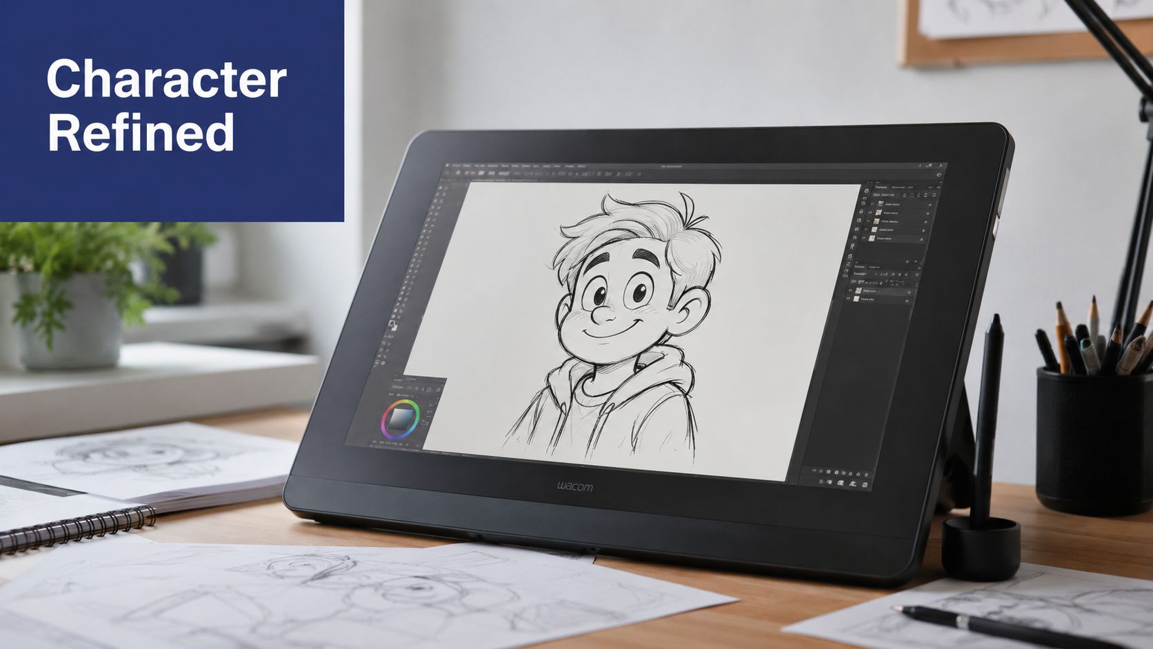
Pringles handled that tension well. The redesign simplified Mr. P without flattening him into a generic icon. The character became cleaner, more consistent, and easier to reproduce across screens and print, while the brand still felt immediately recognizable.
Mascot-based industrial brands face a similar challenge, but with tighter operating constraints. A character mark has to hold up on hard hats, truck doors, stitched apparel, control panel labels, trade show graphics, and distributor materials. If the illustration is too detailed, production quality slips. If the update is too aggressive, internal stakeholders read it as a break from the company they helped build.
Mascots need operating rules
Character marks usually break down in ordinary execution, not in the concept phase. One vendor thickens the lines for embroidery. Another redraws the eyes for a booth banner. A distributor grabs an old low-resolution file and traces it. After a few years, the market sees multiple versions of what should be one recognizable asset.
That creates real B2B problems. Inconsistent mascot artwork makes a manufacturer look loosely managed, especially when buyers compare your booth, your website, your packaging, and your field service materials side by side. Brand inconsistency does not kill a deal on its own, but it can weaken confidence at the exact moment your team is trying to signal reliability.
The fix is disciplined refinement. Keep the recognizable features customers remember. Standardize the parts that vendors tend to distort.
For mascot-driven brands, the practical rules are straightforward:
- Document exact proportions: Fix head shape, facial feature placement, line thickness, and clear space so outside vendors are not guessing.
- Define approved expressions and poses: A character should not look playful on one asset and stern on another unless that range is intentionally designed.
- Set minimum sizes by application: What works on a website header may fail on safety labels, machine badges, or embroidered apparel.
- Specify production versions: Create separate approved files for print, embroidery, engraving, signage, and digital use.
- Explain the update internally: Position the redesign as a quality and consistency improvement, not a rejection of company history.
That last point matters more in manufacturing than many design teams expect. Owners, sales leaders, and long-tenured employees often have a personal attachment to a legacy mark. Presenting the redesign as stewardship usually gets better support than presenting it as creative reinvention. This is the same discipline that supports long-term manufacturer brand building. The goal is to preserve recognition while making the brand easier to manage across every real-world use.
Before & After: 8 Logo Redesigns
| Example | Implementation Complexity 🔄 | Resource Requirements ⚡ | Expected Outcomes ⭐ | Ideal Use Cases 💡 | Key Advantages 📊 |
|---|---|---|---|---|---|
| Firefox Logo Redesign: Simplification for Digital Speed | Moderate, design simplification + coordinated rollout | Moderate, design, QA, cross-channel update | High ⭐, better legibility and faster recognition at small sizes | Legacy B2B manufacturers needing digital-first clarity | Improved scalability, lower production cost, stronger thumbnails |
| Warner Bros. Logo Evolution: Maintaining Heritage While Modernizing | Moderate, preserve core elements while modernizing | Moderate–High, stakeholder alignment and phased rollout | High ⭐, continuity with modern rendering improvements | Heritage brands that must protect recognition | Modern look without losing equity; consistent digital rendering |
| Mastercard Logo Redesign: Subtraction as Innovation | Low, remove wordmark if recognition exists | Low design cost, High brand-awareness requirement | High ⭐, extremely recognizable when awareness is strong | Market-leading brands with global symbol recognition | Space-efficient, language-agnostic, highly memorable |
| Google Logo Evolution: Playfulness Meets Purpose | Moderate, typographic and spacing refinement | High, custom typeface, strict color systems | High ⭐, legible at all sizes while retaining personality | B2B tech/industrial brands wanting personality + clarity | Maintains warmth and recognition; excellent small-size performance |
| Slack Logo Redesign: Symbol Expansion and Flexibility | High, modular system and many lockups to define | High, extensive guidelines, cross-team coordination | Very High ⭐, highly adaptable across product ecosystems | SaaS, product ecosystems, manufacturers with sub-brands | Extreme flexibility; consistent use across icons, headers, apps |
| IBM Logo Redesign: Geometric Precision and Heritage | Low, subtle proportional and type updates | Moderate, precise documentation and phased adoption | Moderate–High ⭐, preserves trust while improving digital clarity | Long-established industrial companies protecting equity | Protects legacy recognition; precise geometry for digital use |
| Tesla Logo Redesign: Minimalism Reflects Product Philosophy | Low, radical simplification but narrow scope | Moderate, testing at multiple scales, global rollout | High ⭐, extreme clarity and engineering-aligned image | Precision engineering, automation, IoT manufacturers | Aligns brand with product philosophy; clear at all scales |
| Pringles Logo Redesign: Character Refinement Maintaining Brand Soul | Moderate, careful character redraw with specs | Moderate, character guidelines and marketing rollout | High ⭐, preserved recognition with better digital rendering | Brands with mascots/characters needing modernization | Keeps emotional connection while improving digital legibility |
Diagnose Your Own Logo Your Next Steps
A logo redesign is more than a new graphic. It's a strategic business decision that affects recognition, implementation, internal alignment, and how buyers read your competence. That's why the smartest logo before after projects start with diagnosis, not sketches.
Start by auditing where your logo appears right now. Pull together your website, email signatures, LinkedIn page, sales deck, quote template, trade show booth, machine decals, product sheets, distributor materials, apparel, invoices, and any physical signage. Then mark where the current logo fails. Maybe it disappears at small sizes. Maybe it feels dated next to your actual product quality. Maybe your team is already using five unofficial versions because nobody can make the approved file work.
Measurement matters too. Companies that scientifically measure logo redesigns from brand recall to conversion rates achieve a 25% increase in brand recognition, while many redesigns happen without that discipline and produce little business impact, according to The Marketing Agency's logo design case study article. If you redesign, define the scorecard before launch.
A practical baseline can include:
- Brand visibility signals: Organic search traffic, brand name search volume, social mentions, and share of voice are all recommended in Visual Soldiers' guide to measuring rebranding success.
- Operational friction points: Count where teams need alternate file versions, manual fixes, or exceptions.
- Sales enablement issues: Note whether reps avoid using the logo in decks, one-pagers, or LinkedIn because it doesn't fit the format.
You should also ask harder strategic questions. Does the current mark reflect the precision of your product? Does it fit the channels where buyers discover you now? Does it preserve the equity your long-term customers already trust? Is the issue the logo itself, or the lack of a usable identity system around it?
Be careful not to over-index on inspiration galleries. Visual roundups are useful for seeing patterns, but they rarely tell you whether a redesign improved trust, lead quality, or implementation in a B2B environment. Even mainstream logo before after content tends to focus on aesthetics rather than measurable business impact, as noted in Freelancer's roundup of famous redesigns. And not every redesign helps. Some B2B updates fail because they weaken recognition instead of strengthening it, a tension also reflected in this Behance discussion of logo redesigns.
One more practical note. If your logo has to work in tiny image formats for social or video publishing, this reference on thumbnail size recommendations from Thumbo AI is a useful reminder that scale is never theoretical. It affects real-world visibility.
The next step is simple. Audit first. Decide what must be preserved, what needs to be simplified, and what usage rules are missing. If you want a partner to diagnose that with you, we're here to help.
If you're a manufacturer, machine shop, or industrial business owner and your branding no longer matches the quality of your work, Machine Marketing can help you diagnose the gap. We help B2B companies connect brand, messaging, websites, content, CRM, and lead generation into one system that's easier to manage and built for growth.